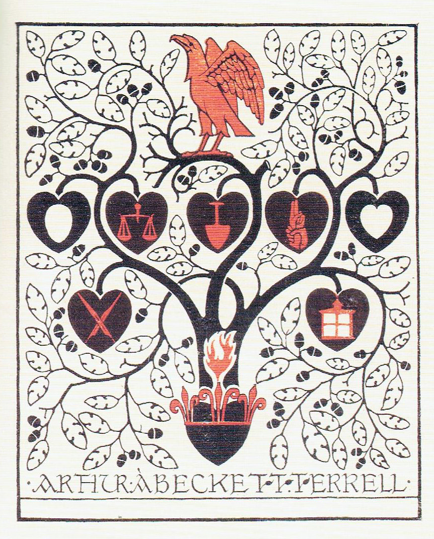
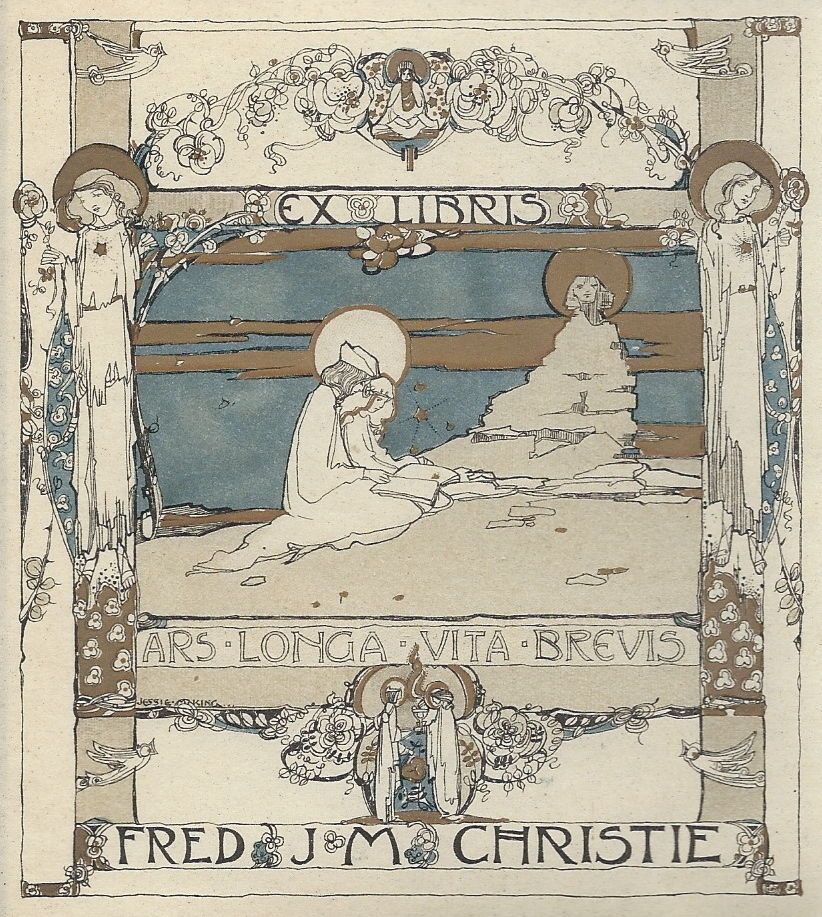
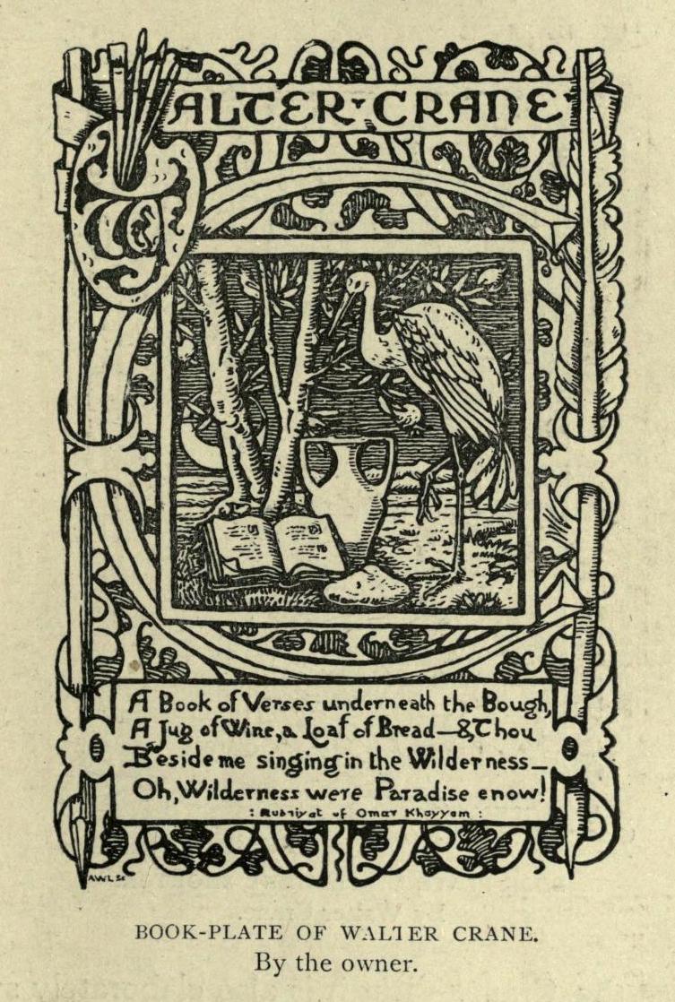
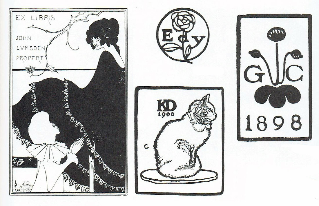
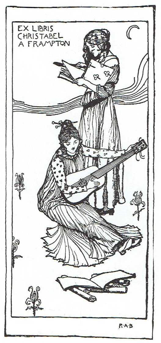
| Bookplate by C.F.A. Voysey, 1917. This was designed for prominent lawyer and Voysey’s emphasis on symbolism was of upmost importance to his design. Voysey himself published an article in 1918 and again in 1928 entitled “Modern Symbolism” in The Builder. Bookplate by Glasgow artist and designer Jessie M. King, 1906. King designed at least 30 bookplates between 1902 and 1910. Many were showcased at the Arts and Crafts Society’s exhibitions in London. The Studio hosted student competitions and bookplates were an appropriate graphic art form within the art school system of the period. Bookplate by Walter Crane. Even for private use, Crane’s design philosophy combined socialist aesthetics and symbols with conventions of children’s literature. The plate refers to its creator (and the book’s owner) in three different registers. The first showing “Walter Crane” printed across the top of the image. The leading “W” appears in two forms; first, roughly formed by four paintbrushes and then below on the artist’s palette from which the brushes emerge. The central illustration, depicts Crane as his animal alter-ego; a crane. His socialistic philosophy of integrating art and life and of creating work that is consistent with one’s identity is well defined in his bookplate. Bookplate by Aubrey Beardsley (left). Beardsley was an English illustrator, author, and a leading figure of the Aesthetic movement. He was influenced by Japanese Woodcuts and emphasized the erotic, grotesque, and the decadent in his work. Beardsley’s contributions to the development of Art Nouveau and the posters styles of the time were significant. Bookplates by Gordon Craig (three on the right). Craig was an English actor, director, theatre scenic designer and writer. In 1904 he wrote is most famous work, the essay The Art of the Theatre. He also was well known for his patented movable screens and set design for the Moscow Art Theatre production of Hamlet in 1911. | Every book lover knows that a book loaned often becomes a book lost. Sharing your treasured books can often be a losing business. So, how can you gently remind the borrower it’s your property, with hope to see it once again? Enter center stage, the innovation of the bookplate. A bookplate is also known as an ex libris in reference to the Latin inscription meaning “from the books of…” The earliest known example dates back to 1450, the same year as the birth of printing from movable type. Many early bookplates were designed to safeguard the books of barons and nobles. Because of this they were adorned with coats of arms and other indicators of inherited prestige. This was the case through the 18th century. The Victorians with their love of gathering “beautiful things” realized as early as 1875 that bookplates were collectable. In his 1880 publication on bookplate collecting, John Byrne Leicester Warren recognized four distinct styles in early British bookplate design: early armorial, Jacobean (including Restoration, Queen Anne, and early Georgian), Chippendale (rococo), and wreath and ribbon (Victorian). The 19th century saw the rise of the middle class. Scholars, professionals, and other educated individuals became interested in bookplates and commissioned works in a pictorial vein. These drew from classical and symbolist iconography and were heavily influenced by The Arts and Crafts Movement. In 1891 a few British bookplate collectors met in London to establish the Ex Libris Society and by the end of that first year, it had grown to more than 300 members. The Society began publishing the Journal of the Ex Libris Society and it was published through 1909 with 18 volumes in all. As the collecting of bookplates from previous generations was gaining popularity, the demand for new bookplates also grew. Interest in bookplates reached its peak around the turn of the century but began to decline with the onset of the First World War. Over the next 100 years, interest has come and gone, but for me at least, the height of the art of the bookplate is directly linked to the European Arts & Crafts era. Today there are some 50 ‘national’ bookplate societies that gather world-wide every two years. Celebrated artists like Walter Crane, Aubrey Beardsley, Robert Anning Bell, Jesse M. King, Gordon Craig, and C.F.A. Voysey created beautiful works of art, knowing that they would only be seen by a select few. It the bookplate is one of the most intimate forms of personal art during this era. Art for Art’s sake, a treasure to be hidden away in a book somehow becomes more romantic to me, than art meant to be on display for all. Personal art, originally meant only for high society, now acknowledged the social principles put forth by John Ruskin and William Morris; no matter your station in life, you deserve to enjoy refinement and objects of beauty. Many of the artists of the time saw bookplate design as a new artistic challenge. To reduce the artwork to such a small size and to create with only a limited color palate, or even just in black and white, gave way to graphic design. Simple line contour had to speak volumes. Shape had to be distinct enough to allow instant recognition. In response to these artistic challenges we can see the birthplace of the modern logo. And art wasn’t just made from oil or egg tempura anymore. Ink was king! Early innovation in the artistic printing press was akin to adding a snare drum to the band for the first time. Such rich and bold notes had not previously been heard, and could be shocking to the ears. Even today, there is fine art--leave room for the Grand Canyon--and then illustration, including typography. In the 1990s, I received Cs in some of my painting classes at Colorado State University because I wasn’t “painterly” enough. One memorable professor said my work just wasn’t “cooked in” yet. I’ve always been drawn to sharp, defined line work and expressively bold shape. Creating a visual gut-punch of emotion with fewer details always wins in my book. Simplicity of design can be seen as the very foundation of refinement. Oh how I would love to transport back in time to dine with the bookplate artists of the Arts & Crafts Era and hear if they too experienced the inferred or even at times outright scowl from the fine art world. Art should always be personal. These artisans took the time to create small, concentrated drawings that delight to this day like humble lyrics to a whispered song. Next time you are shopping for old books, take the time to open their front covers. You never know what delicious details may be in store for you there. You may even feel the previous owner looking on, hoping to get their beloved book back. They took the time to mark it, after all. This article was written by Julie Leidel for the Colorado Arts and Crafts Society. Bookplate by Robert Anning Bell. Bell was a fine artist painting in oil and gouache. He designed stained glass windows and mosaics for many churches and from 1895 to 1899 Bell was an instructor at the Liverpool University school of architecture. In 1911 he was appointed chief of the design section at the Glasgow School of Art. |
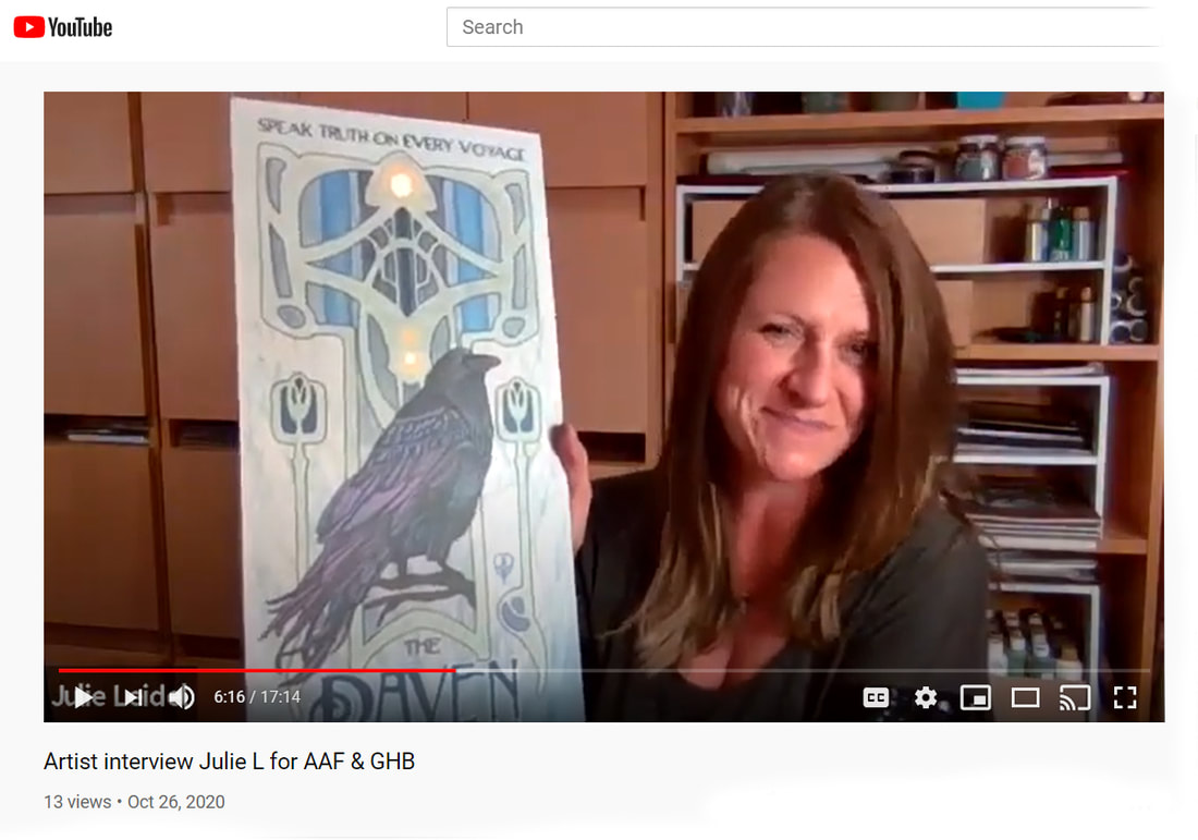
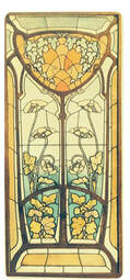
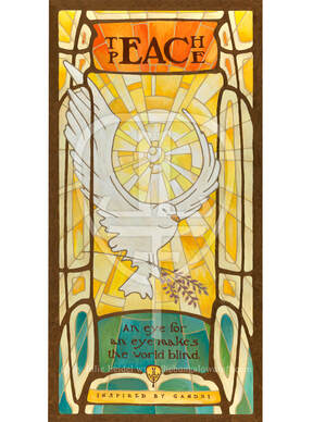 I had been wanting to create a painting featuring a dove for quite awhile. As tensions have been rising over the course of this year, it was on my heart more and more. Here's a bit of why I created the artwork I did, and the symbolism that it holds for me. Peace - it's something that takes a great amount of effort, time, commitment, and redirection. It doesn't come naturally to most of us, it needs to be taught - to our children and to ourselves. The idea that peace isn't something that just lands upon us is important to remember. It's a beautiful idea that needs ACTION, not inaction. "Teach Peace" is inscribed at the top of my Art Nouveau dove as a reminder to find and seek out peace in our own hearts. Others may see our searching and be inspired. The actionable quest to attain peace is also hinted at in my painting. My deconstructed peace sign is in two parts: the circle held within the dove's wings, and the vertical "fork" is being grasped in the dove's hold as a sprig of lavender. Lavender is believed to bring peace and harmony and is regarded as a symbol of love, happiness, devotion and protection by many cultures. Peace takes work. Breath... stepping back and letting cooler heads prevail. It's never fully constructed, it's always a work in progress. "An eye for an eye makes the world blind." These words are inspired by Gandhi, but not directly attributed to him. All forms of spirituality and religion hold peace on high as a refinement of what we can strive to attain as humans with enlightened spirits and hearts. My art nouveau take on this concept had a perfect home within the theme and feeling of stained glass. Below is a picture of an Art Nouveau stained glass window from the early 1900s. I stumbled upon in on Pintrest, but sadly there were no identifying marks or information for me to learn more about the artist or the artwork. I loved the light and flow of this design, and you can see my inspiration starting point from this piece. |
AuthorJulie Leidel shares news and musings on inspiration for her artwork. Archives
May 2024
Categories
All
|

 RSS Feed